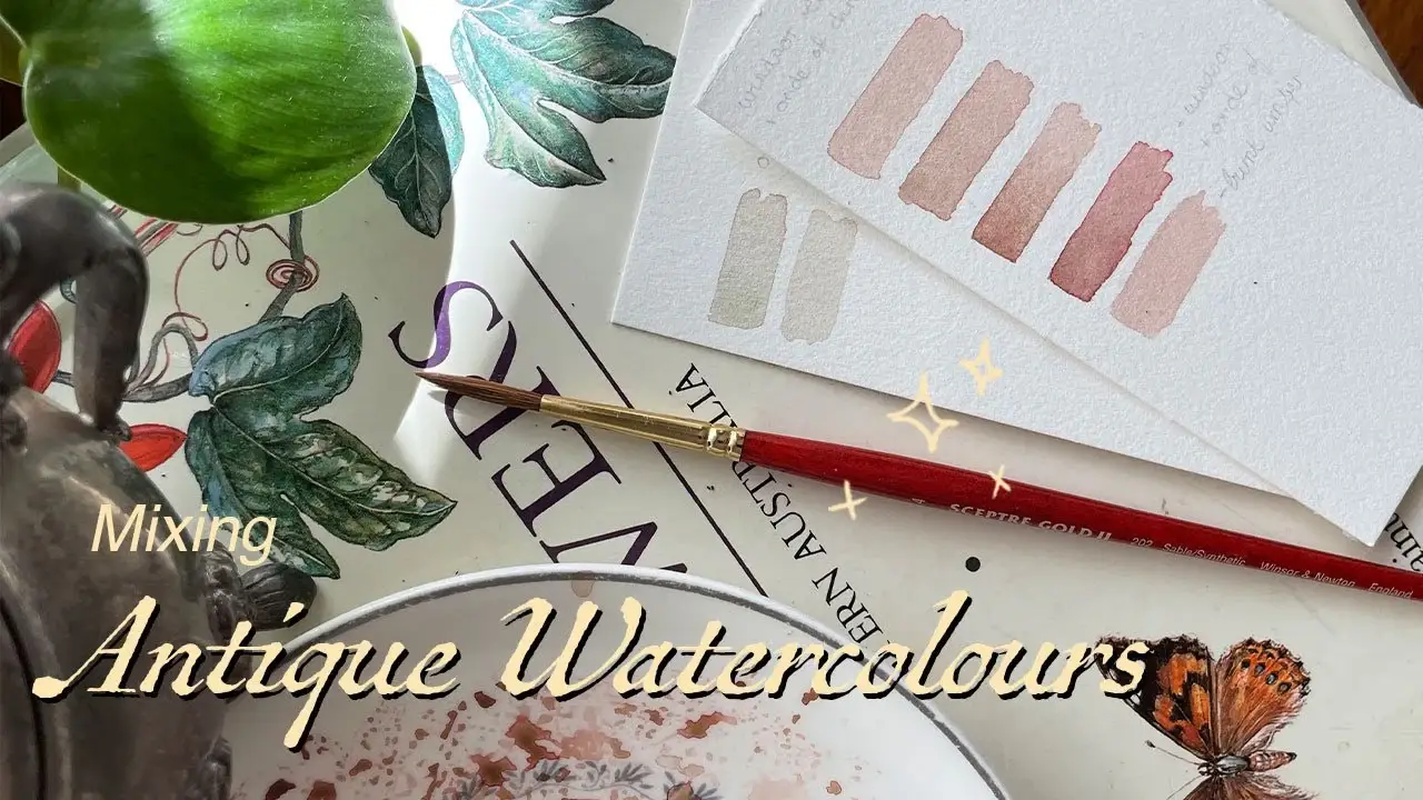
In this video I show you a simple way to mix muted watercolours.
Muted Watercolour palettes are great for antique or vintage style paintings, or for any one that prefers softer colours. I hope you enjoy it. Its a bit different to my other videos but I get asked this question constantly, so hopefully it is helpful.
Transcript
I think one of the most frequent questions I get asked on YouTube, in the YouTube comments, and via email is how I make my colours the way they are. Personally, I love muted colours. If a colour is too saturated, it sort of hurts me. I definitely have some sort of colour sensitivity. In this video, I’m going to show you how I mix my muted colours for most of my paintings. I’ll use red or pinkish-red and green as examples, but the logic works for any colour. I’ll explain how you can apply this logic to any colour.
First, we’re going to gather the colours we need. I’ll start with some Winsor Red, Burnt Umber, and Chromium Oxide Green. Add the Winsor Red and Burnt Umber to your palette, and then we’ll take a little bit and mix them together. The Burnt Umber doesn’t really do anything in terms of colour theory; I just like the way it looks. But that’s not where the magic happens.
Next, we mix these colours together. The green is the special one because green is opposite to red on the colour wheel, and colours that are opposite each other mute each other. That’s the little secret to getting muted colours. Mix a tiny bit of the Chromium Oxide Green into the Winsor Red, and that’ll create a nice dusty pink colour.
Hopefully, you can see how we can apply this logic to any colour. All we need is a colour wheel. Look for the colour opposite the one you want to mute on the colour wheel, and add a tiny bit of that colour to your mix, and it will mute it.
Now, we’re going to do the same with our green. We’ll look at our color wheel and see which colour is opposite green—it’s red. Instead of adding green to our red, we’re going to add a little bit of red to our green. Green will be the dominant colour, but the red will mute the green so it’s not as bright. That’s how I do it, and I apply this method to any colour.
© All Rights Reserved 2024 Cave Dwller